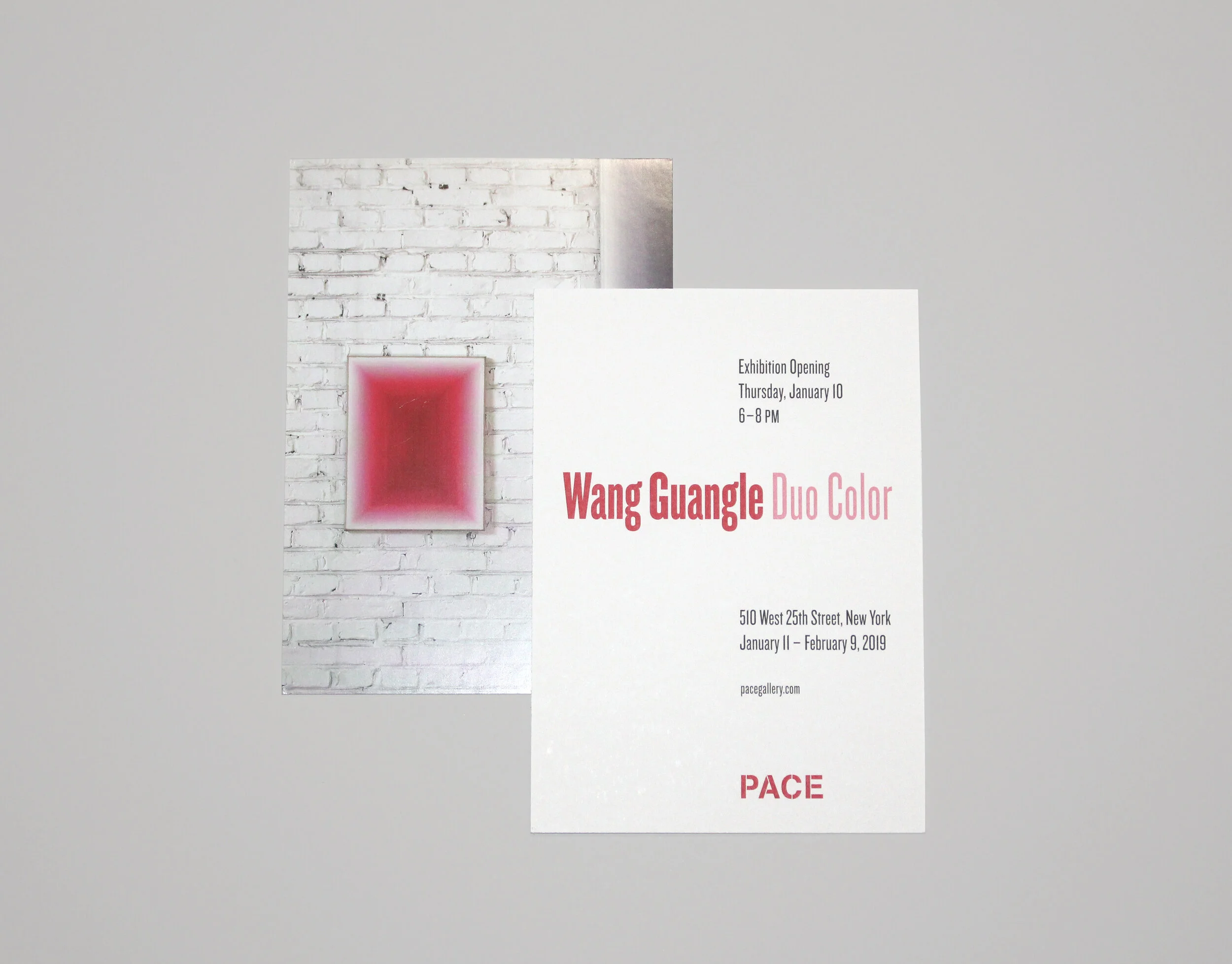
Pace Exhibition Announcement Cards
At Pace Gallery, each exhibition has an identity with a unique type treatment. After researching the artist and studying their work to determine an appropriate theme or direction, I select typefaces with careful consideration. The fonts must reflect the works in the exhibition, pair well with the artwork selected for the announcement without overpowering it, and be versatile enough for use in the corresponding catalogue. I consider print methods and paper stock as well, in order to ensure that the artwork is reproduced effectively. Each announcement is designed under supervision of the Art Director, and must be approved by the Art Dealer and the artist or estate.
One of my favorite announcement cards to work on was for the Tony Smith: Source, Tao, Throwback exhibition. The typeface is sturdy and strong like the three colossal sculptures in the exhibition. The works are bronze with a black patina, and each panel reflects light differently. To reference this quality, we foil stamped “Tony Smith” in black on black paper, and printed the remaining text in a silver Pantone. The reflective foil encourages the holder to move the card and view from different directions, just as a viewer of Tony Smith’s sculptures is encouraged to walk around and view from all angles.
Creative Direction: Tomo Makiura


