Week 3: Following Letters
It's the end of week three and we're well on our way to completing our typefaces!
On Monday we continued to sketch characters. I had finished about half the alphabet in lowercase and five capitals over the weekend. I narrowed down my concept as well; I decided my typeface will be for a history magazine. Think Nat Geo History: a magazine that covers a wide range of historic topics and is intellectual and modern. I want the typeface to reference Renaissance forms but to have enough character to bring a unique and modern personality to the (fictional) publication.
With this in mind, I continued to develop the character set. We focus on the lowercase first since they carry most of the personality. I begin with quick sketches to get a sense of the form, then use parts from existing letters to trace wherever possible and make a more refined (but still rough) marker version that can easily be read after it’s scanned and scaled down.


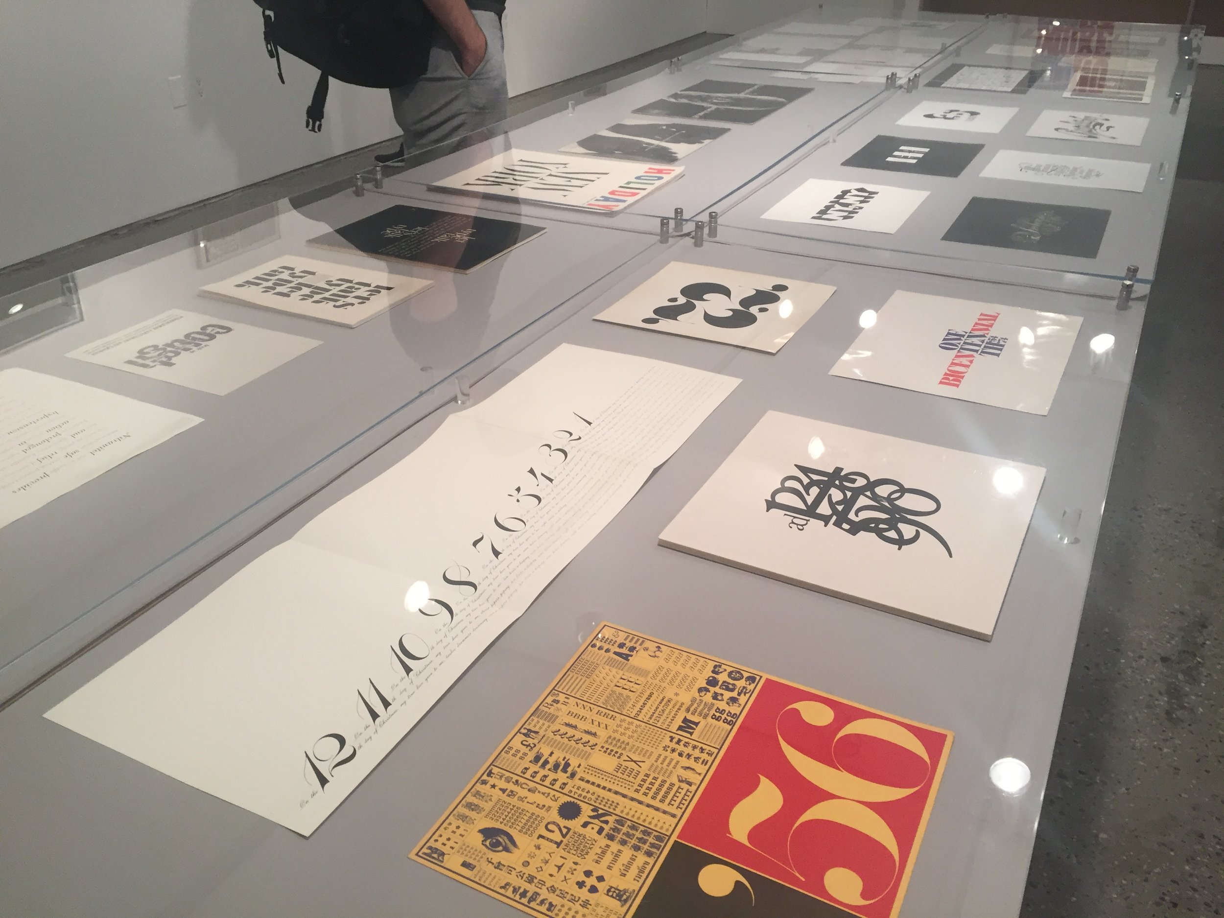
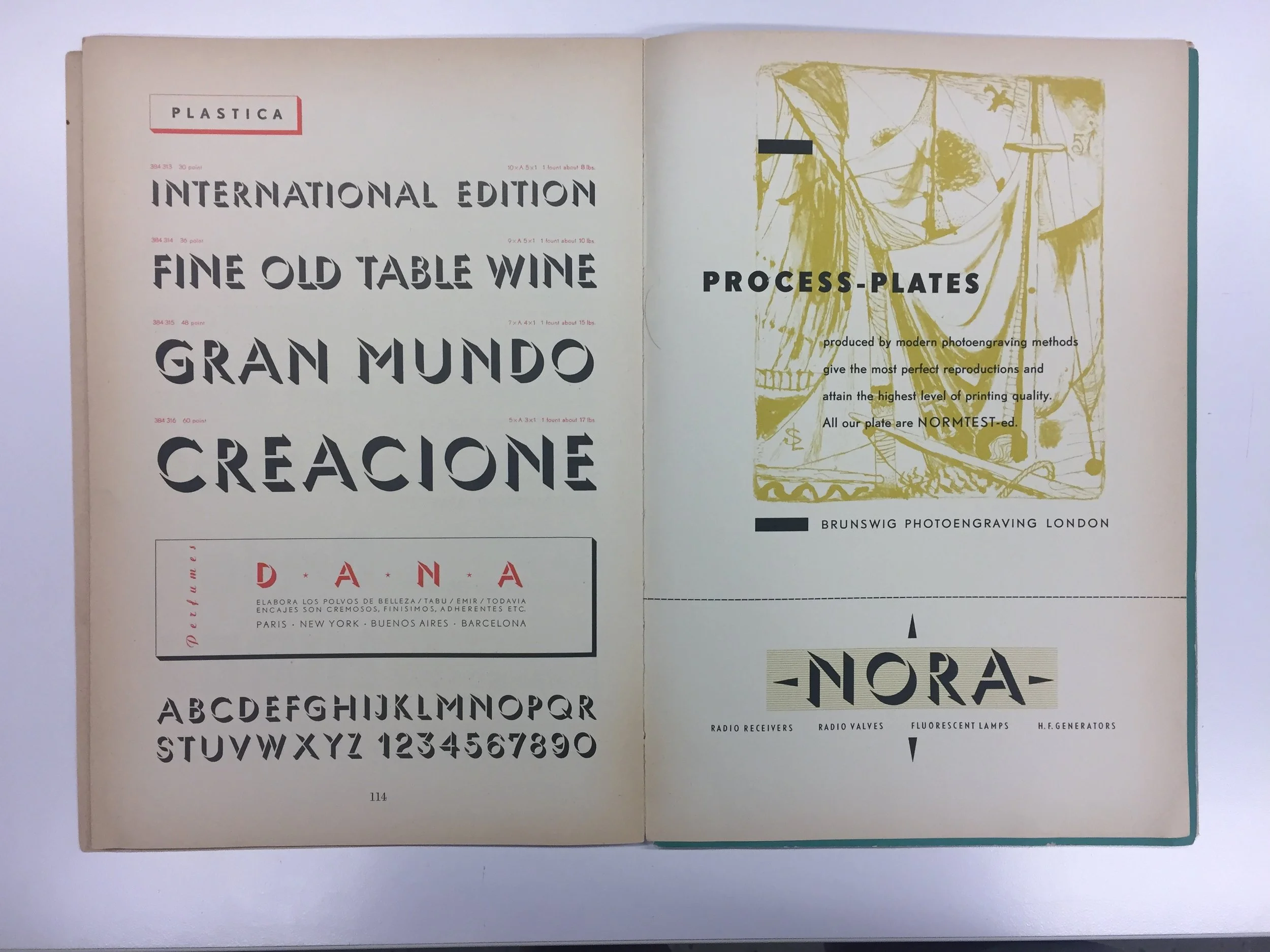
In Sasha’s class we visited the Herb Lubalin Study Center of Design and Typography, which is housed in Cooper Union’s 41 Cooper Square building. There is currently an exhibition of Lubalin’s work celebrating his centenary, so we all looked around before class started. Sasha had selected some books and specimens from the large collection for us to look at. While the study center was founded to house Lubalin’s work from his studio, the collection has grown to include books and works that span a wide range of topics from the history of writing to hand lettering to packaging design. Sasha had selected a few specimen books that blew me away; one from Berthold Type Foundry and the other from Bauer Alphabets, Inc. I also looked at a copy of The Origin of the Serif. I love the drop cap illustrations at the beginning of each chapter and the calligraphic flourishes at the end.


During our night class I talked to Troy about my concept, and he suggested sharpening the serifs for a more chiseled affect. In addition to having a historic feel, this would prevent the soft, rounded edges from getting fuzzy at small sizes. Once I started sharpening the edges I found that it really added personality that could show through at larger sizes, such as a drop cap or headings.
Hannes gave us an overview of RoboFont so we could begin digitizing. I began with my “n” and “o”, using scans of the sketches for reference. Once the basic DNA is established many other letters can be created, so I will reference my sketches as necessary and will continue to sketch as needed for certain letters.
Wednesday was Independence Day so we didn’t have class, but Sasha lead a walking tour of Brooklyn in the late afternoon. We walked about four miles (with a short break halfway through to sit down and have a drink) in a sort of zig-zag through several neighborhoods, a route he designed to "follow the letters". They ranged from stone cut inscriptions on buildings to hand painted signs to iron manhole covers.


After the tour some of us got dinner at Habana Outpost, a Mexican/Cuban restaurant with a large outdoor eating area. By the time we were done eating it was too late to catch fireworks, but we decided to walk to the Brooklyn Bridge. Unfortunately it was closed off to pedestrians, but instead I walked to the river for a beautiful view of Manhattan at night.

On Thursday we continued working on our typefaces. I was still refining my “n” and “o”; since they are so important to the DNA I wanted to be sure they were as refined as possible before moving to the other letters. I adjusted the weight and contrast and made the serifs smaller. It’s important to keep a spacing window open in order to see multiple letters at a time to get a sense of the color and feel of the type.


Once I had an “n”, “h”, “o”, and “a”, I used a text generator to make a series of words with the letters and printed them out to check the contrast, color, and form at various sizes. After seeing it in print, I changed the bowl of the a to include a sharper turn of the pen to better match the sharp angle of the serifs. I also increased the contrast overall as it felt a little dark.
We had a morning class on Friday since we were off on Wednesday. I realized that although I have a tendency to want everything to be metrically “perfect”, I’m learning the importance of trusting my eyes and making optical adjustments. While I begin with determined values such as stem width, I’ve often needed to change them by a few points. This finessing of details is honestly one of my favorite parts of type design; it’s like solving a puzzle, except there are many possible pieces that can fit and you’re looking for the one that fits just right and blends in best with the overall picture.
I now have about 10 lowercase letters complete, although I've still been making small changes as needed. Once I'm really satisfied with the letters I have, I'll crank out the rest. That way I won't need to backtrack if I have problems, and the following letters will come together smoothly. I love printing out test paragraphs; seeing the letters I designed become a real thing gives me goosebumps every time—I'll never get sick of that feeling!