Week 2: Finding the Rhythm
Week two is complete, which means we're already almost halfway through the program! This week was just as packed with information, instruction and inspiration as last week (for the record, that alliteration was unintentional but I don't mind how it worked out).
Ewan began the day Monday by talking about the ways a calligrapher analyzes a manuscript. We then practiced using these methods to recreate part of a humanistic minuscule manuscript. Later he had us work with a pointed pen, which results in expansion contrast as opposed to the translation contrast we’ve been working with so far with the broad-nib pen. The pointed pen is controlled with pressure rather than pen angle, so it feels very different. We experimented with some script, as is commonly created with this pen, but then tried some romans. It was surprisingly difficult to create romans, although script was hard as well for me. There’s actually a pointed pen oblique calligraphy workshop by Vichcraft coming up in July that I’m thinking of taking because I’d really like to improve my skill in this area.

In Hannes’s class we sketched letters with specific instruction on their weight, width, and contrast to see how each change would effect the letterforms. It was often more difficult than I expected, especially for ultra condensed and light since I am used to working at roughly the same weight and width. It was a great exercise to get us thinking about where the weight should change and how to condense or extend a letter.
On Tuesday Hannes encouraged us to explore different styles and begin sketching ideas for our typeface. I knew I wanted to do something traditional with medium contrast, so I experimented mostly with different types of serifs, although I still tested some “extreme” letters as well just to keep stretching those muscles.


In the afternoon we visited Columbia University. We spent our lunch break eating outside on the gorgeous campus. We then spent class in Butler Library looking at myriad beautiful manuscripts. I was particularly captivated by The Art of Writing, in its Theory and Practice (1712) by Charles Snell. The copy-book includes scripts by Charles Snell that were reproduced using copperplates. I'm also intrigued by the story behind Romain du Roi so I was excited to see a specimen book of the typeface, titled Épreuves des Caractères Français Employés a l'Imprimerie Impériale and published in 1810.


Our night class was with Ewan. We learned about the development of italics, then practiced the rhythm by writing “hmn” several times, then adding each letter of the alphabet afterwards, ie. “hmnt”, until we had written every letter. Ewan compared the rhythm of italic to the flow of the Arno river over the rocks in Florence. I really liked this analogy, especially since I heard that very sound only a few months ago.
Italics are challenging, but with more practice I started to get a better sense of the rhythm. The hardest part was keeping the set width of my u’s and n’s the same. It is also tough to maintain the same very slight angle, particularly of the ascenders and descenders. Once again, I can really appreciate how much discipline and practice it must take for calligraphers to produce such beautiful work.
On Wednesday we began by taking some time to practice italics again. Ewan promised we’d improve just after a night, and he was right! I was actually surprised when he asked me to compare the two; the letter spacing, rhythm and proportions were much better (although there is still plenty of room for improvement).


Next, we practiced spacing. We began by writing words in skeleton Roman capitals. By looking at letters in threes—looking at the previous two letters to determine where the third should be—we were able to create even spacing. We did a number of exercises to improve our spacing; one was to all go to an open area of the hallway and walk around each other, seeking to fill in empty spaces without running into anyone. This forced us to use our peripheral vision and really think about all of the space around us. When we all returned to our capital letter sketching, our spacing had improved.


Sasha lectured on typeface design for newspapers. Typefaces had to be designed specifically for legibility to compensate for the poor printing conditions of newspapers. They needed to be printed cheaply and quickly, which of course didn’t benefit the type. We also looked at a few newspaper type specimens from the Lubalin Center collection.
On Thursday Ewan began class with a series of exercises in controlling the speed, force, and direction of the pen. For example, a fast, direct, strong stroke would mean thrusting the pen across the paper very quickly and forcefully, creating unique patterns of ink. For each variation of movement we began by creating abstract lines and then drew capital and lowercase As using the method. It often produced very interesting results. It really was helpful to think about how all of these different factors contribute to the look and feel of calligraphic marks.


Afterwards we reviewed the history of writing and how each form developed into the next, such as Old Roman Cursive developing into uncials, which contributed to both Gothic and Lombardic capitals. Ewan's final lecture was about a few of the calligraphers who were most influential in integrating Roman capitals and minuscules and the letterforms that ultimately became widely used and understood in fonts. His final remark was for us to think about what we are making and putting out into the world as designers and how this will affect our lives and lives to come.

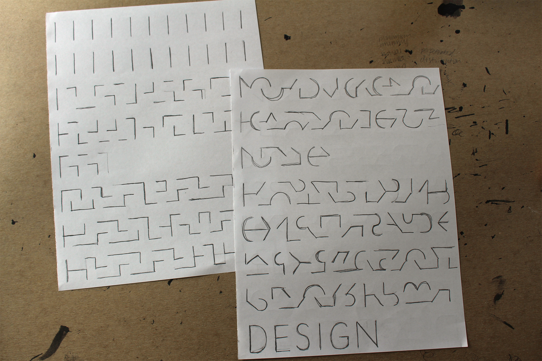
We were all sad to say goodbye to Ewan, but as we begin developing our typeface next week, Troy Leinster will be joining us as an additional instructor. In fact, he joined us Thursday night as we had our first informal critique on our typeface ideas. After some sketching I scanned the letters to scale them down, which is a simple way of revealing any and all flaws. I continued to refine the letters and add a few more characters until it was time for our critique. I presented three similar text faces with slight differences in contrast and serifs. After receiving feedback from Hannes and Troy I need to narrow down the concept of its application, but I’ve determined that I’m going to continue with the first style (the one that spells “jengabvf”).


I continued to sketch more letters this past weekend and I'm looking forward to really kicking into gear with my typeface this week!