Week 4: Exponential Growth
I know it’s cliché, but I can hardly believe how quickly the weeks have flown by. I’ve been living in New York for over a month now! Things are really starting to get crazy in class. We now have less than one week to complete our typefaces and prepare a process book and presentation. It’s also sinking in that I only have one more week of constantly being in the East Village. I’ve been trying to make sure I don’t go to any usual spots so I try something new every time I eat or grab coffee. And while I have a little less time to walk around and explore during my lunch and dinner breaks these days, I’ve still found a way to walk down new streets or discover something new in a familiar area.
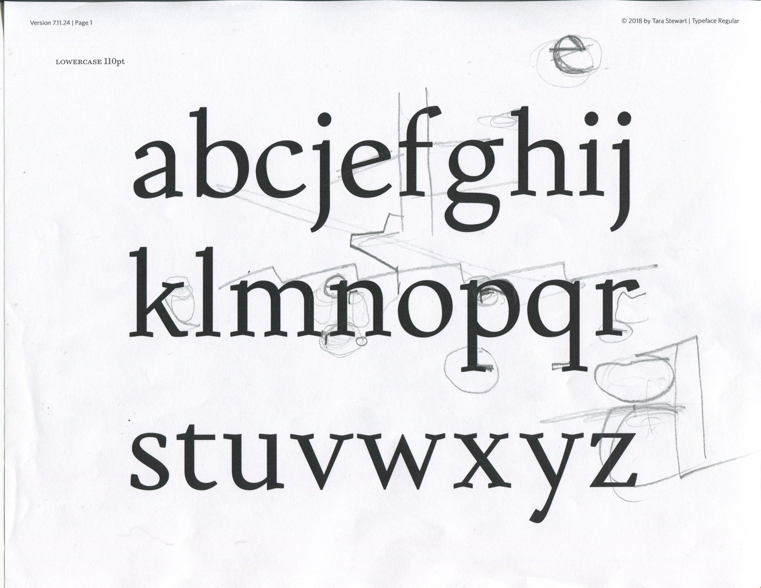
At the beginning of the week I continued to develop my lowercase set. I had almost all of them complete by midday on Monday and showed them to Hannes, who immediately told me that they were all expansion contrast, which is based on the pointed pen, meaning the heaviest weight is in the center of the curves. I had added a lot of contrast since my sketches, and had unfortunately added it in the wrong places so that the stress was too vertical, like a didone. Hannes had me re-sketch the "o" and "n" with the new weight and contrast so that I could see where the weight should be and directly trace the sketch. Thankfully, since it was only the curves and arches that had a problem, once I fixed my “o” and “n” I was able to quickly adjust the rest of the letters. I could see that the color of the text really improved after this change. After all, I am going for an old-style Renaissance look, so translation contrast (based on the broad-nib pen) is definitely best, regardless of the requirements for the course.


Monday night we had another guest lecture, this time with Christian Schwartz and Berton Hasebe from Commercial Type with Patrick Li from T Magazine, the New York Times Style Magazine. They talked about the many typefaces they’ve designed for the magazine over the years. I really enjoyed hearing about their process, especially their latest pair, Kippenberger and Fact. They showed the stages of development, their inspiration, and what the process was like working on two typefaces at the same time. The pair were designed with the urgency of today’s culture in mind as well as the idea of visual density. Fact was inspired by Herb Lubalin’s typographic covers of Fact magazine, and adapts a bookish 20th century typeface for fashion. It is particularly intriguing to me as my typeface is very traditional, but through certain details and elements I aim to make it feel friendly and modern to give the history magazine some approachability and personality.
On Tuesday I began developing more capitals while making adjustments to the lowercase. The capitals are challenging because they are based on a different writing tool than the lowercase; rather than a pointed pen, Roman capitals were brushed (and then carved). Thus the stress is more vertical, however they often show a hint of the broad-nib pen. Finding that balance has proven difficult. But Hannes always says to “trust your eyes”, so when in doubt I try to make optical adjustments until they feel right, especially when printed in context, 8-10 point in sentence case.
By midday Wednesday I finished drawing my capitals. They all still needed refinement, but I wanted to have an idea of the letterforms to show Cyrus Highsmith, our guest critic. His feedback was very helpful; he pointed out a number of details that could be improved, including extending some serifs and softening the points of the diagonal letters. He also pointed out that although the serifs are odd, they were indeed working at the target size.

On Thursday I powered through the recommended revisions and made some adjustments to my capitals. I also brainstormed names (right now all my files include the name “Typeface”), but I still haven’t landed on the right one.
This week one of my classmates described type design is an exponential function, which I think is really true. Once the basic shapes are formed from the "n" and "o", a number of letters can quickly be made. Then with each new letter, different details are designed that can be reused in other letters, and so on. It helps for me to think this way if I feel stuck on a letter. Sometimes I’ll move on to another letter for a while—for example, when I was struggling to get my "S" right I moved on to the "Q", a letter that allows the designer a lot of creativity and fun due to the many different possibilities for the tail. Then I was able to return to the "S" with fresh eyes. But other times I need to get it right before I can move on, like when I was working with the "B". I needed to get the bowls right, or at least decent, before moving on to the "P" and "R". But once I did, I ended up using the bowl of the "P" to improve the lower bowl of the "B". I think if I had to make a chart by drawing a line from each character to the characters whose pieces were used to build it, I’d end up creating an endless web. But while it sounds complicated, and I suppose it is, it’s also helpful to think that way when I have trouble with a letterform. There’s usually some other character that I’ve got right that I can use to improve or inform the one that’s giving me trouble.
This weekend my goal is to complete the full character set so that I can spend next week refining small details and working on my process book and presentation. I know pictures were minimal this week, but I’m excited to share more of my typeface once it’s complete. I hope you’ll check it out next week!