Week 5: Albanus
This week felt a lot like finals week in college. I had a lot to do, drank too much coffee, and at times wondered if I'd make it. But like finals, everything worked out in the end and there were no casualties.
The work was all about refinement. I began the week with all of my characters and figures and most of my punctuation designed, or at least the basic shapes were hammered out. I had started my diacritics as well, and designed them on the lowercase “o”s first so that I could look at them in context and refine them before making them separate glyphs and using them as components.
Jesse Ragan, one of the founders of the Type@Cooper program, visited on Monday to critique our typefaces. His feedback was really specific and helpful. Some of his more general recommendations were to extend all my serifs and make my caps heavier, so I ended up going through all of the letters to make those changes. I rounded the serifs a tiny bit more at this point too so that if it is used at large sizes they aren’t too sharp.
Once I had most of my characters done I knew it was time to give this typeface a name. I looked at a lot of Latin words since Latin is historic in and of itself and is also the language used for the mosaics in St. Peter's that provided inspiration. Nothing seemed to fit right though, and many of the Latin words I found are overused. I broadened my research to the subject of Roman history, and ended up reading about some regions in Italy, including Alba. I dug deeper and discovered Saint Alban, the first British martyr. The Latin form of the name is Albanus. According to tradition, Saint Alban sheltered a fugitive priest named Amphibalus (also a great name). When his house was searched, he disguised himself as the priest and was arrested instead and (like all the good saints) beheaded. So what does this have to do with my typeface? Well in addition to being an interesting story, it brings everything full circle, connecting history and Rome and the Church. Plus it's kind of cool that a typeface intended for historic context has a name with its own history.


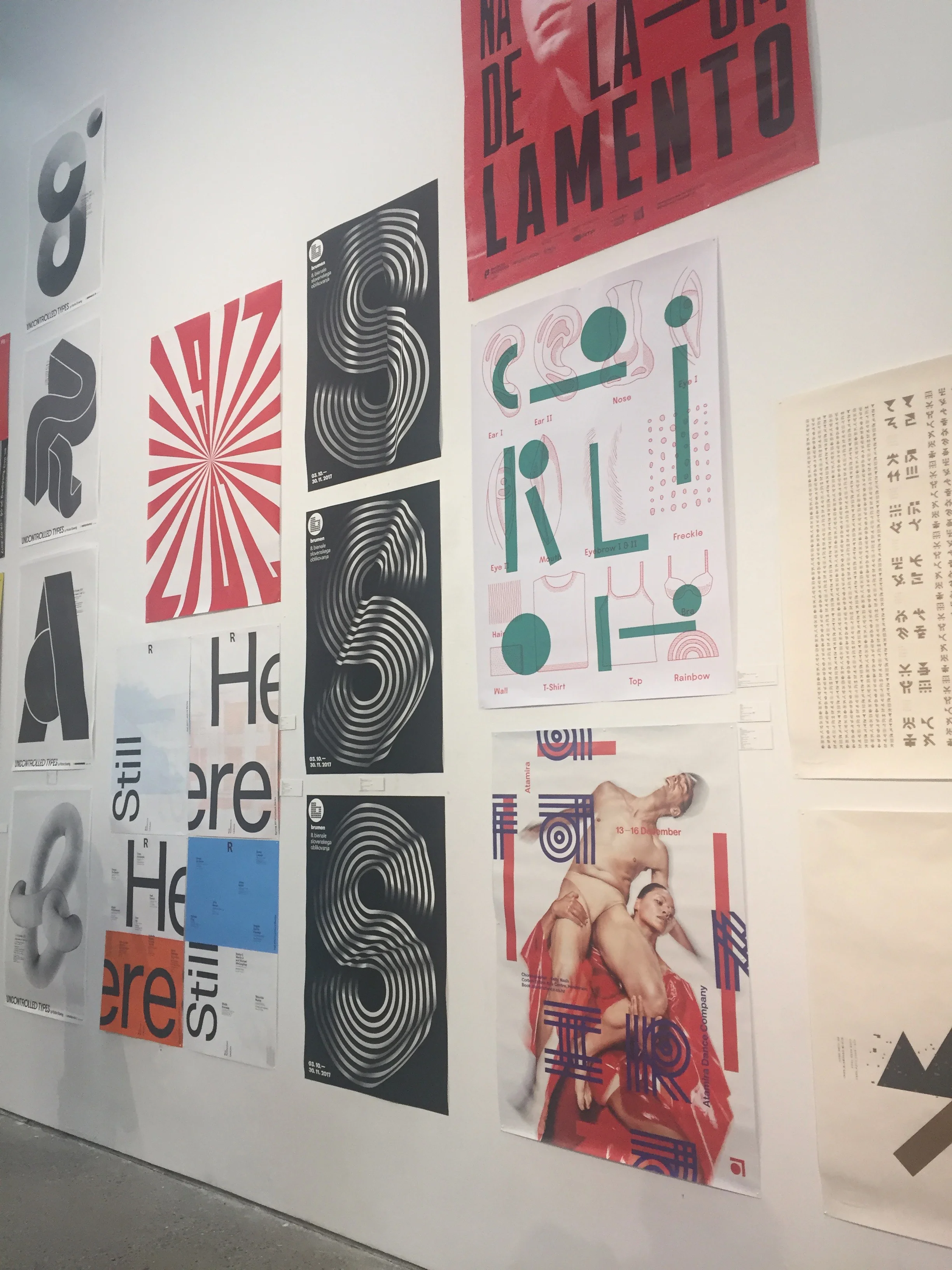
On Wednesday we took a short break from our work to pop in to the TDC 64 exhibit. We had to get back to work before the presentation, but it was great to see all of the work—and there was so much!


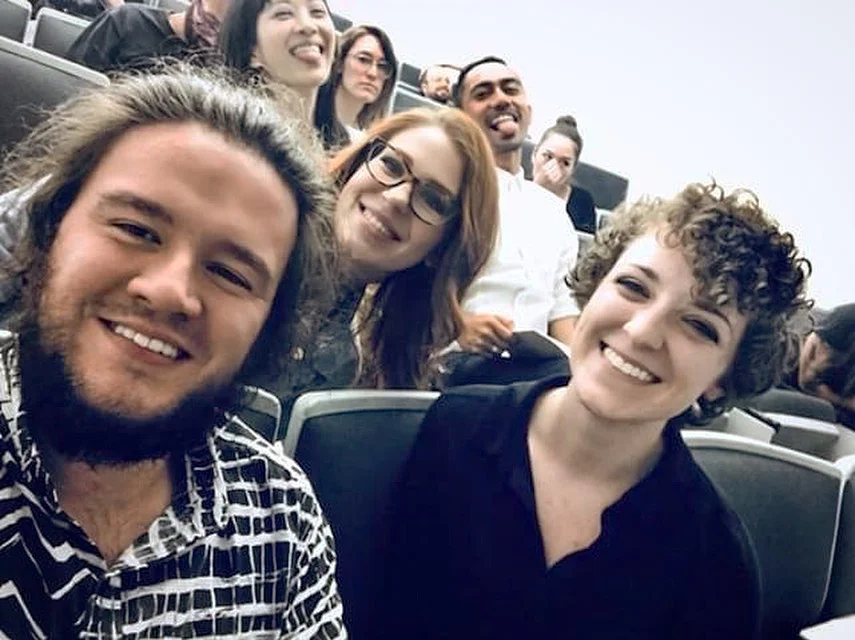
Thursday was presentation day. We had the morning to finish things up before presentations began at 3pm. It was great to hear about everyone else's process, and to see the huge variety in the typefaces we all developed. We talked about our struggles: many we shared, some were unique. The quality of my classmates' work was really impressive.


After the presentations we had a pizza party! All of our instructors plus some of the TA's celebrated with us. Some of us decided to explore the rest of the building, since all we'd seen was the second floor where our studios were.


So that’s the story of my experience at Type@Cooper, and how Albanus came to be. But the story continues; I have a lot of plans for the future. I definitely want to develop a display version with more rounded shapes, including the serifs. It could be used for editorial use as well, but would be for headings and drop caps and anything around 12 points and up. I also want to design lining figures and perhaps even some ornaments. But first I need to work on the spacing and kerning of Albanus Text.


I feel like I’ve learned so much in five short weeks; I have a much greater appreciation for and understanding of calligraphy, metal type, and the history of type design, and I’ve learned a lot about trusting my eyes and not focusing too much on the metrics and numbers.
If any of you readers are considering applying to Type@Cooper: do it. It's a really great experience, even beyond just learning about type. I had the opportunity to meet so many interesting and intelligent people and to explore New York and be surrounded by people passionate about design and typography. Even if you've designed typefaces before, it's a great way to get feedback from professionals and meet other people in the field. If you don't know much about type and want to learn, it's for you too. The students this year were extremely "uneven" in professions, years designing, etc—so don't think you aren't qualified. We each learned from each other's different backgrounds, and we all had different struggles and lessons to learn. The program is also a great way to figure out whether you may want to continue your education in typography; many people go on from the program to KABK or Reading.
Albanus has come a long way since the beginning, but I’m excited to see how it continues to develop and change. I’m sure there are even more lessons that Albanus will teach me.

Thanks for taking the time to read! I hope you found this helpful or interesting or enjoyable or all of the above. Perhaps I'll blog more in the future, but goodbye for now!